
The Shopify Space
understanding the context
Shopify is one of the leading platforms for online commerce. It allows to build, customize and manage online stores. Within it, merchants can plug in a wide range of apps to their businesses to increase traffic, capture leads, promote products, handle logistics, monitor performance and boost sales. Amplified, formerly Consistent Cart, has been around for six years and has become a competing all-in-one alternative for store owners in the SMB segment.
However, before 2022, the app was used mostly to recover lost sales from carts abandoned during the shopping process. This cart recovery tool was its core feature at the time; it was effective and required limited interaction from the user. The other features, such as basic email marketing, automations, and segmentation, still needed to be coherently developed. They had low usage rates due to uninviting, messy workflows and a confusing interface.

Some of the initial Consistent Cart screens: Dashboard, Segment builder, Pricing Plans (from left to right).
*
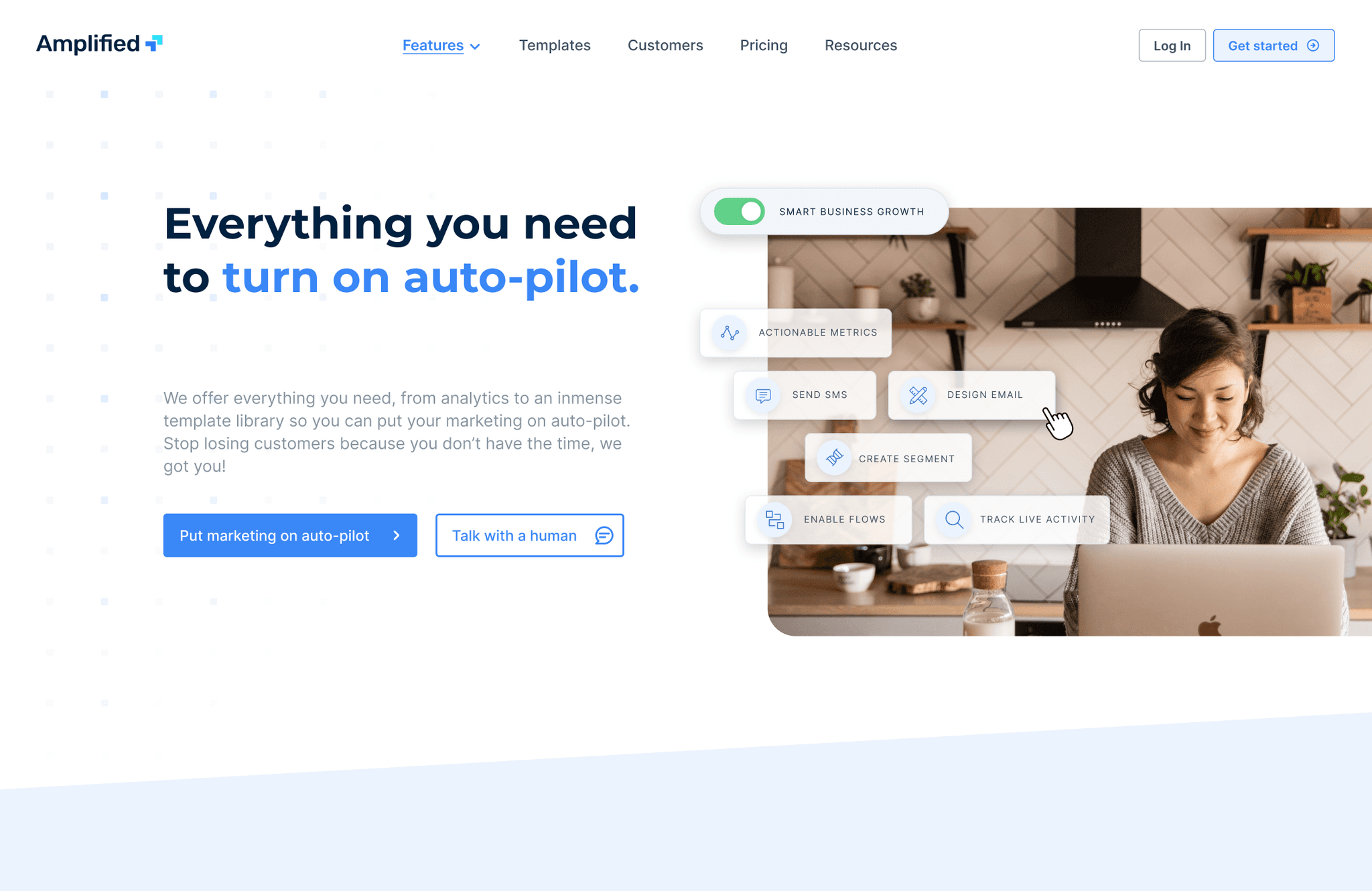
Strengthening the app feature offer to compete as a whole marketing platform.
I came on board as the first product designer in a heavily oriented dev team. We aimed to reframe the feature approach to fit the users' needs and expectations in order to reduce churn rate, increase usage and build brand recognition. We focused on making every feature more desirable and pleasant while simultaneously rethinking the app's brand and communications.
Research approach
Explore & discover
The app redesign was broken down into small projects per feature. Each of them followed a similar research and definition approach based on the nature of the double diamond model and a design thinking iterative logic.

In-app Surveys
We conducted short, targeted surveys to understand the current level of satisfaction and familiarity with the app and its four main features (Cart recovery, live activity, campaigns, and automations). Answers were grouped by users' subscription type (free or paid) and their store's monthly revenue. This way, we profiled user groups based on impressions, usage, and their expectations of the app.
We focused on the data collected from 250 active stores with monthly revenue of 500 USD or higher.

Interviews & User Sessions
We conducted semi-structured interviews through internal channels like intercom and a private discord channel we created to have a closer interaction with a sample of 15 of the regularly active users. The aim was to understand their bottlenecks and pressing needs. 10 Exit interviews from users that had uninstalled were also included in the process.
We went over Hotjar sessions and heat maps on a weekly basis to pinpoint the weaknesses in the navigation structure and the pain points when interacting with the different sections at a top level. As the app had multiple layers of complexity, this first approach was meant to collect the most visible pressing issues rather than deconstruct every feature (something we would do later on).
Competitive Analysis
This was an ongoing resource present in the research phase for every feature. This specific board served as our first dive into competitors. We centered on analyzing their dashboards and layout to rethink the structure and navigation of our app. We used it to identify strengths and deficiencies at this initial point of contact and as a guide for ideas we could include or pivot.

*
Store owners knew and used the app only for one feature; in most cases, the rest was secondary or unknown to them.
New and long-time users agree that a step-by-step approach and consistent visual language are needed.
Tech-savvy users are a minority. The average user expects contextual help and visual guidance to make informed choices.
Merchants work in various desktop screen sizes that demand a more responsive and scalable layout.
Users exploring the features feel that menus and critical actions are way hidden.
Improvising workarounds and back-and-forth actions are common user behavior that leads to frustration.
Users consider support essential but value the ability to complete the tasks alone.
Users are interested in tools that centralize their marketing activities instead of relying on multiple ones.
Mobile usage of the app rarely happens. When it does, it is only to monitor or track carts/sales.
A clear, concise onboarding is fundamental to help the app's adoption rate.
Interpret & Define
Synthesizing findings
PROBLEM
The app lacked clear guidance and clarity. The intended features had hidden menus and patched workarounds that caused repetitive actions that were confusing and detrimental to the user experience. The main workflows were not intuitive, lacking active feedback and mechanisms to account for their impact from a user’s perspective. Because of this, feature adoption was hard to promote and sustain.
PROBLEM statement
1. How might we restructure the app and its main features to allow users with limited marketing and tech knowledge to get up to speed with the tools we offer quickly?
2. How might we reposition the app in the Shopify App Store as a solid competitor in the email marketing platforms segment?
Personas
With the problem framed, we used the information gathered during discovery to create personas that would remind the team of the users' archetypes through the redesign process.


Sitemap
We ran tree tests to validate a new navigation structure for the app, seeking a clear way of organizing features, tools, and info sections in an intuitive way without cluttering the sidebar.

user flows
With the app structure redefined, we translated the findings and user feedback into short user stories to start rebuilding every section. The following images describe the user flows we mapped for two features: Campaigns and Automations. These more logical steps responded to tasks derived from such stories. This process was repeated and adapted according to the granularity of every redesign project.

Create an email campaign | User story: As a store owner, I want to create new email campaigns, so I can send messages to my customer list.

Create automation | As a store owner, I want to set up automated messages, so I can reach clients at precise moments of their customer lifecycle.
Ideate & Prototype
wireframes
From this point forward, we entered a constant iterative process. User flows would be developed into wireframes to explore different alternatives at low and mid-fidelity levels. They evolved weekly through user feedback, adapting incremental improvements that ultimately shaped comprehensive workflows for all of the tasks.


Design System
This fast-paced process was possible by rebuilding our library of UI assets and introducing a design system for consistency. We picked more suitable fonts for display and created a type scale to ship a better scalable product. Our system was based on atomic design and aimed to be relatable to Shopify's Polaris design system so that users could interact with a visual language they were already familiar with.


Branding & Visual language


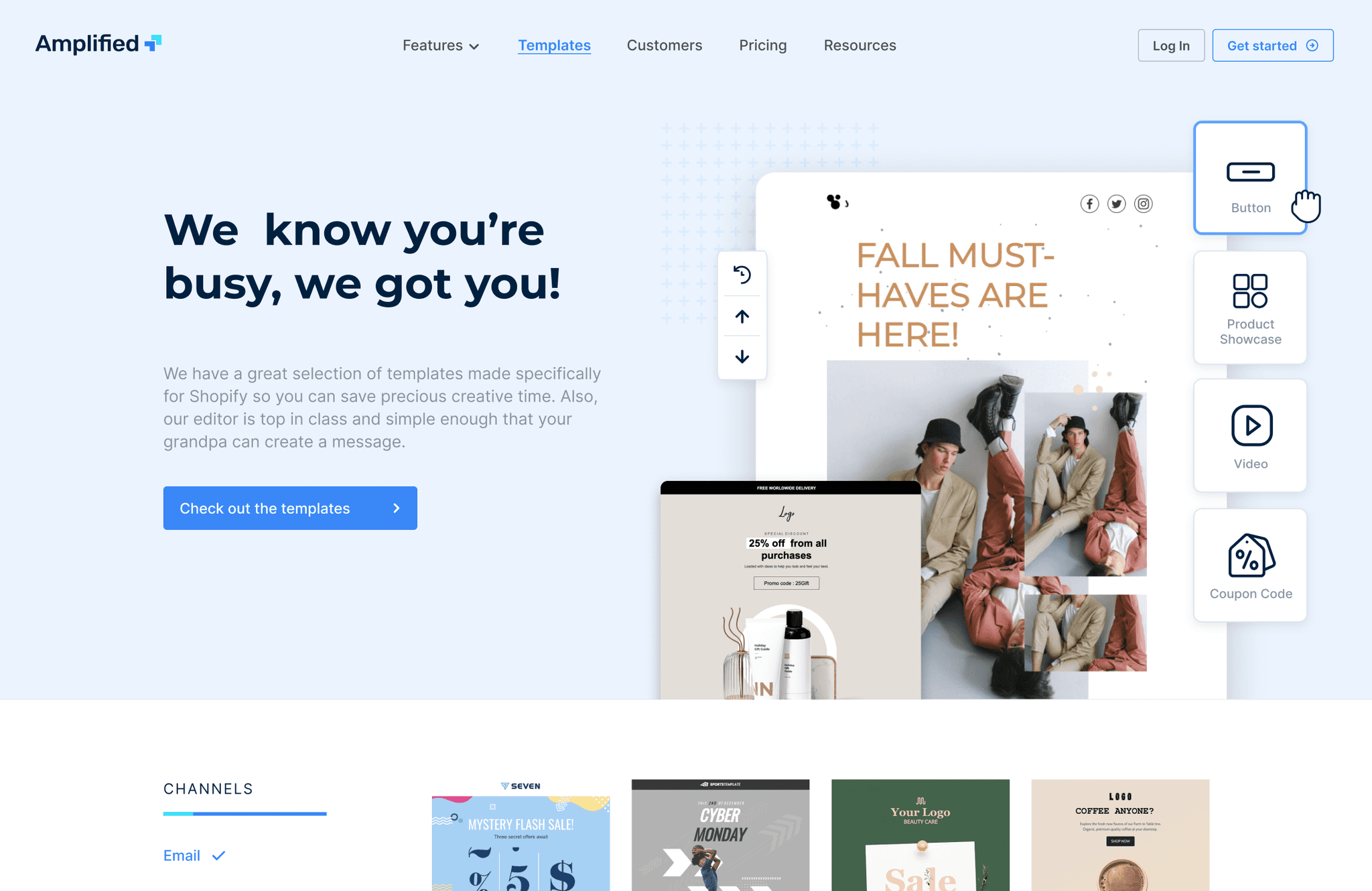
prototyping and outcome
The synergy of a solid visual language with a scalable design system and fast product iterations based on ongoing research allowed us to create and refine prototypes for every section. These prototypes were continuously tested with users and sometimes even pushed directly into production to see how different cohorts would react and interact with the new workflows and interface.
These are some views of the resulting main sections where contextual visual cues, active app feedback, and a more effective hierarchy of information account for a more intuitive and pleasant experience. Amplified is still evolving but this is the most recent version as of January 2023. It has been updated and rebranded on the Shopify ecosystem, competing with other platforms under the Marketing Automation category.


Wrap Up
These progressive victories were framed in a 100% remote work environment with a cross-functional product team of 7 people (4 devs and 3 designers). As the first product designer, I advocated for the implementation of research methods and usability testing. I was also responsible for leading the redesign of the full suite of Cartkit apps. These included Better Replay, Pop Convert, and Sales Pop, which was acquired by a third party in late 2022.
